Why a clock became the warning
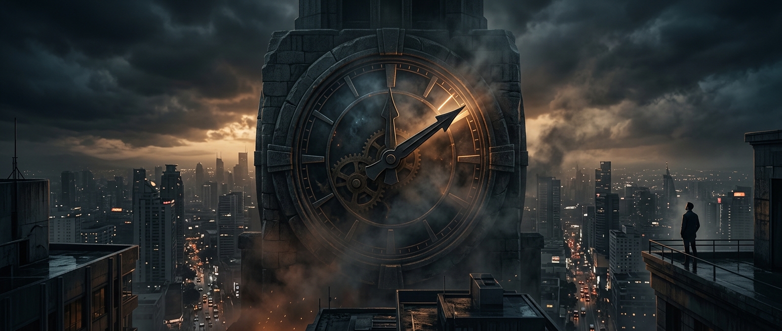
The Doomsday Clock began as a way to make an abstract danger legible. In 1947, the Bulletin of the Atomic Scientists introduced it on the cover of its magazine. The image turned the threat of nuclear war into a familiar visual: a clock face nearing midnight. Its purpose was not to predict when disaster would happen, but to make the urgency of preventing it hard to ignore.
What moving the hands means
The clock is set through a judgment by the Bulletin’s Science and Security Board, with input from its Board of Sponsors. They consider dangers that could threaten human civilization, including nuclear weapons, climate change, and technologies that may create or intensify global risks. The hands do not emerge from a formula that converts each danger into a precise number of minutes. Instead, the setting expresses the board’s overall assessment of whether the world is becoming safer or more perilous.
That distinction matters. A change in the clock is a public signal about the direction and seriousness of risk, not a claim that catastrophe has become a measurable amount more likely. The board can weigh developments that are difficult to compare directly—for example, the possibility of conflict alongside the longer-term effects of greenhouse-gas emissions—and communicate its conclusion through a single image.
A warning meant to provoke action
Because the clock compresses several dangers into one symbol, it cannot show which risk is most urgent or how a particular decision would change the setting. Its value is different: it gives the public a memorable prompt to ask what is driving the assessment and what could reduce the danger. The hands measure concern, not time remaining—and their position can change when human choices alter the risks.