Why the Game Boy’s screen was a design choice
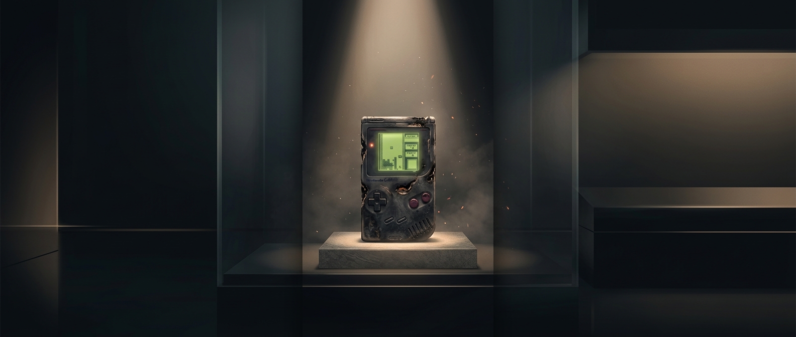
A handheld console has to carry its power source with it. In 1989, a bright color screen was costly and hungry for electricity; a simple reflective LCD could run for much longer because it used ambient light rather than a backlight. The original Game Boy’s display showed games in shades of gray-green, but it made a practical bargain: players could take the system along without quickly exhausting its batteries.
That bargain reflected Gunpei Yokoi’s idea of “lateral thinking with withered technology”: use technology that has become familiar and inexpensive in an unexpected way. The point was not to make the most advanced device on paper. It was to combine affordable, dependable parts into a product people could actually use for hours.
A limitation that shaped the games
The screen could not reproduce color or show fine detail, so designers had to make characters, objects, and obstacles readable with a small set of tones. Clear silhouettes and strong contrast mattered more than visual realism. That constraint encouraged games to communicate through simple shapes and instantly recognizable movement—qualities that worked especially well on a small screen.
The display also depended on light from the surroundings. It was easy to use outdoors or in a bright room, but difficult to see in dim conditions. Players had to accept that inconvenience in exchange for a machine that was comparatively economical to power and cheaper to build than a more elaborate color handheld.
The payoff was a portable system
Color competitors could offer a more vivid picture, but a handheld is more than its screen: its usefulness depends on how long it runs, how much it costs, and whether players can carry it without fuss. Yokoi’s approach put those tradeoffs at the center of the design. The result was not the most impressive display of its era; it was a system whose games could travel with the player for far longer than a short burst between battery changes.