Why Preschool Shows Lean on Bright, Simple Color
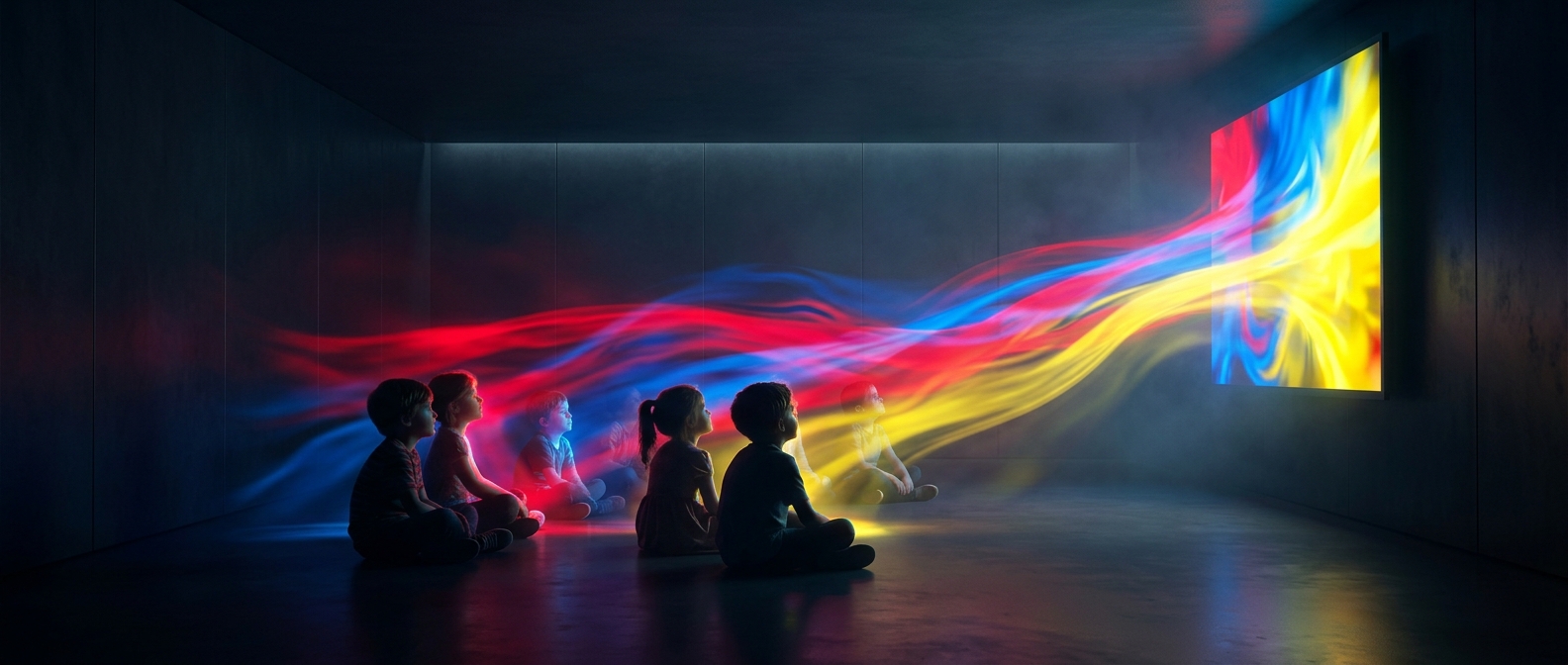
A vivid red toy against a blue background is easy to pick out because the colors differ sharply. In children’s programs, saturated colors—colors that look intense rather than gray or muted—help important objects stand out from the rest of the frame. A moving character, a bright prop, or a sudden change in color can give a young viewer a clear place to look.
That is attention, not hypnosis. Brightness and color do not guarantee that a child will watch, and a screen full of equally vivid objects can be harder to follow than one with a clear focal point.
Color Helps Organize the Scene
For very young viewers, a simple visual design can make action easier to read. Strong differences in color help separate a character from a background or one object from another; recurring colors can also make familiar characters and props recognizable from scene to scene. Red, blue, and yellow are common choices because they are vivid and easy to distinguish in many combinations, though children’s programs use a much broader palette.
The design challenge is balance: make the subject noticeable without letting every detail compete for attention. A bright object placed against a calmer background can guide the eye more effectively than a frame in which everything is equally loud.
A Tool, Not a Guarantee
Color works alongside movement, sound, facial expressions, and pacing. Producers can use a flash of vivid color to mark a new action, but the child still needs a scene that is understandable and engaging. The practical aim is not simply to make the screen brighter; it is to make the important thing easy to find.