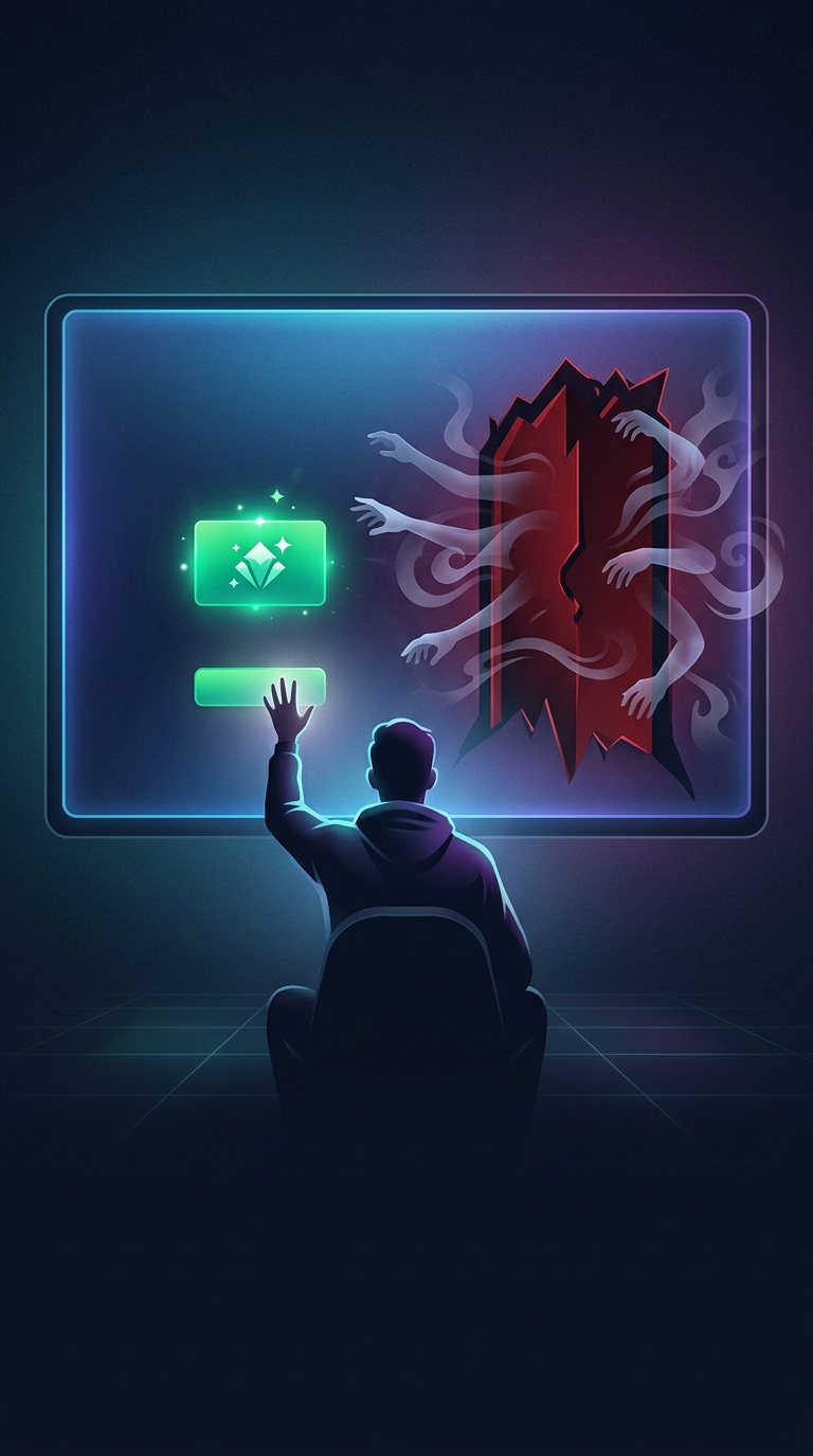
How consent screens steer the first click
A privacy pop-up is also a tiny decision interface. Its designer controls what catches the eye first, what takes the least effort, and which option feels like the natural next step. A bright, oversized button has greater visual weight than a small, muted link, so people scanning quickly are more likely to notice and choose it.
That advantage matters because accepting can be made into a single, immediate action, while refusing may require opening another screen, changing several settings, or searching for a less prominent control. The extra steps create friction: even people who would prefer to limit tracking may accept simply to get back to the page.
Why the right side feels like the default
In interfaces designed for people who read left to right, the right side often serves as the endpoint of a visual scan and a familiar place for a primary action, such as “Continue.” Putting acceptance there can make it feel like the screen’s forward-moving choice. That convention is not universal, but it can reinforce the button’s size and color.
Together, these choices are often called dark patterns: interface designs that nudge people toward an outcome they might not choose if the alternatives were equally visible and easy. The nudge does not require hiding the refusal option completely. A noticeable difference in contrast or effort can be enough.
The practical test
A useful way to judge a consent screen is to compare the paths, not just the labels: Can you reject optional tracking as easily as you can accept it? If one choice is a single bright click and the other is buried behind extra steps, the layout is doing more than collecting a preference—it is shaping one.