The texture is a warning you can feel
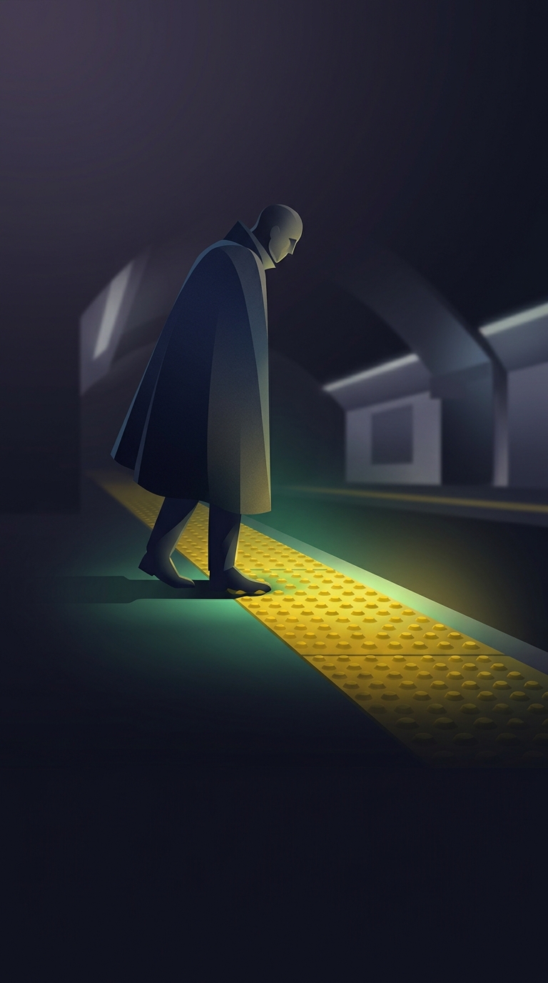
The raised bumps along a subway platform are designed to stand out from the smooth floor around them. For a blind or low-vision passenger, that contrast can be detected with a cane or underfoot, signaling that the platform edge is near before it can be seen.
The pattern matters as much as the fact that the surface is raised. A distinct, repeated texture is easier to recognize as a warning than a subtle change in flooring. Its blunt bumps are meant to be noticeable without forming sharp points that could injure someone who steps on them.
A tactile boundary, not a force field
The strip gives passengers a cue to slow down and orient themselves; it does not physically prevent a fall. Its position leaves a warning area between the bumps and the drop, so someone who detects the pattern has a chance to stop before reaching the edge. The strip also helps distinguish a hazardous boundary from ordinary floor texture in a noisy, crowded station where visual attention may be elsewhere.
The surface can provide some grip, but traction is not the main reason for its pronounced pattern. The key job is to communicate: this is a boundary that calls for caution. That message is especially important when a train is arriving, people are moving around, or a passenger is navigating by cane.
Why make the signal so unmistakable?
A warning that is too smooth or too similar to the surrounding floor may go unnoticed. The aggressive texture makes the cue legible through touch, while keeping the warning strip continuous along the platform edge. It turns a boundary that might otherwise be invisible into something a traveler can detect before taking the next step.