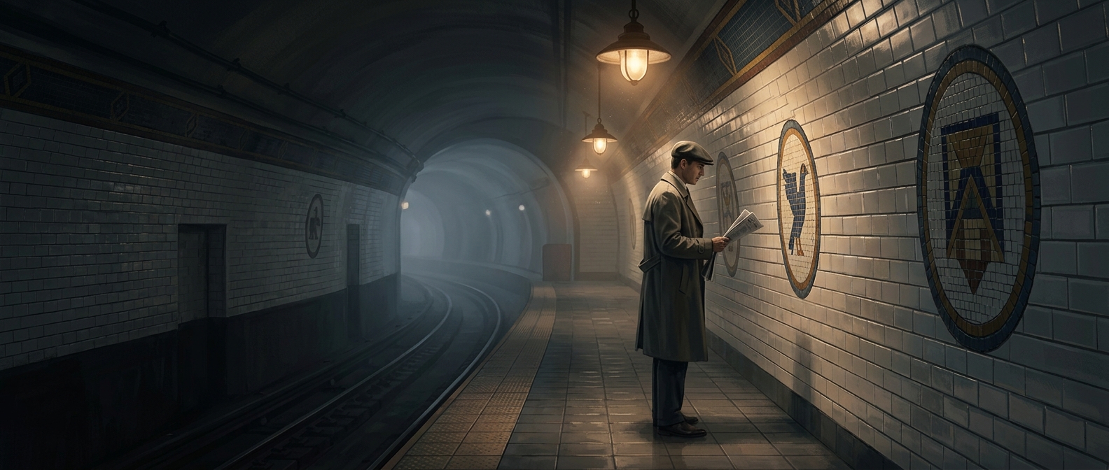
Color Turned the Station Into a Landmark
A station name on a sign is useful only if a rider can spot it, read it, and connect it to the right platform. Color offers a faster kind of cue: the eye can register a vivid patch before the brain has read any words. When stations use distinct tile colors or patterns, riders can learn to associate a visual look with a particular stop.
That recognition matters in the moving, crowded space of a subway. A passenger may be watching the doors, tracking a child, or trying to judge whether the train is approaching the right station. A familiar band of color on the wall can confirm the stop without requiring a close look at a sign. It works as a landmark embedded in the station itself, not just as information printed on a board.
A Visual Cue, Not a Complete Map
The tiles are most useful when riders encounter them consistently as they enter or pass through a station. Repetition turns an unfamiliar wall treatment into a learned signal: see the color, recognize the place. That can help people orient themselves even when they do not know the station’s name immediately.
Color cannot tell a first-time rider where to transfer or which exit to take, and similar shades can be hard to distinguish in poor light. Text and maps still do that work. The advantage is that tiles add another layer of navigation—one that can be noticed quickly, even in the brief moment when a train stops and the doors open.