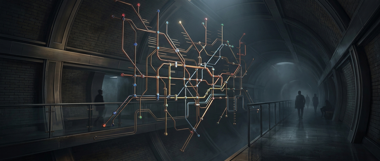
A route diagram, not a street map
A geographically faithful map would make the Underground harder to read. In central London, many lines and stations crowd into a small area; farther out, routes spread across a much larger region. Drawn to scale, the center would become a tangle while outer stations would be separated by wide stretches of paper.
Harry Beck’s diagram solves that problem by showing how stations connect, not how far apart they are. Lines follow a limited set of clean directions, and station spacing is adjusted to keep names and junctions legible. The result preserves the information a rider usually needs to choose a route—where to change trains and which stations lie along a line—while discarding much of the network’s actual shape.
What the distortions change
The map makes central stations appear farther apart than they are and some outer stations closer together. It can therefore mislead anyone using it to judge walking distance or the time a trip will take. Two stops that look adjacent may still require a train journey; a short-looking gap between stations may be quicker to walk than to ride through the network.
That trade-off is useful because navigating transit is primarily a problem of sequence: find a line, follow it to the right interchange, then continue to the destination. Simplified geometry lets the map emphasize those decisions instead of competing with them for attention. Geographic maps and signs are still needed when a traveler wants to orient themselves above ground.
Beck’s design became the model for the familiar Tube diagram, and the same principle appears in transit maps elsewhere: make the network easy to follow, even if the city has to bend on paper. The map is most reliable when read as a set of connections—not as a ruler.