A closer look
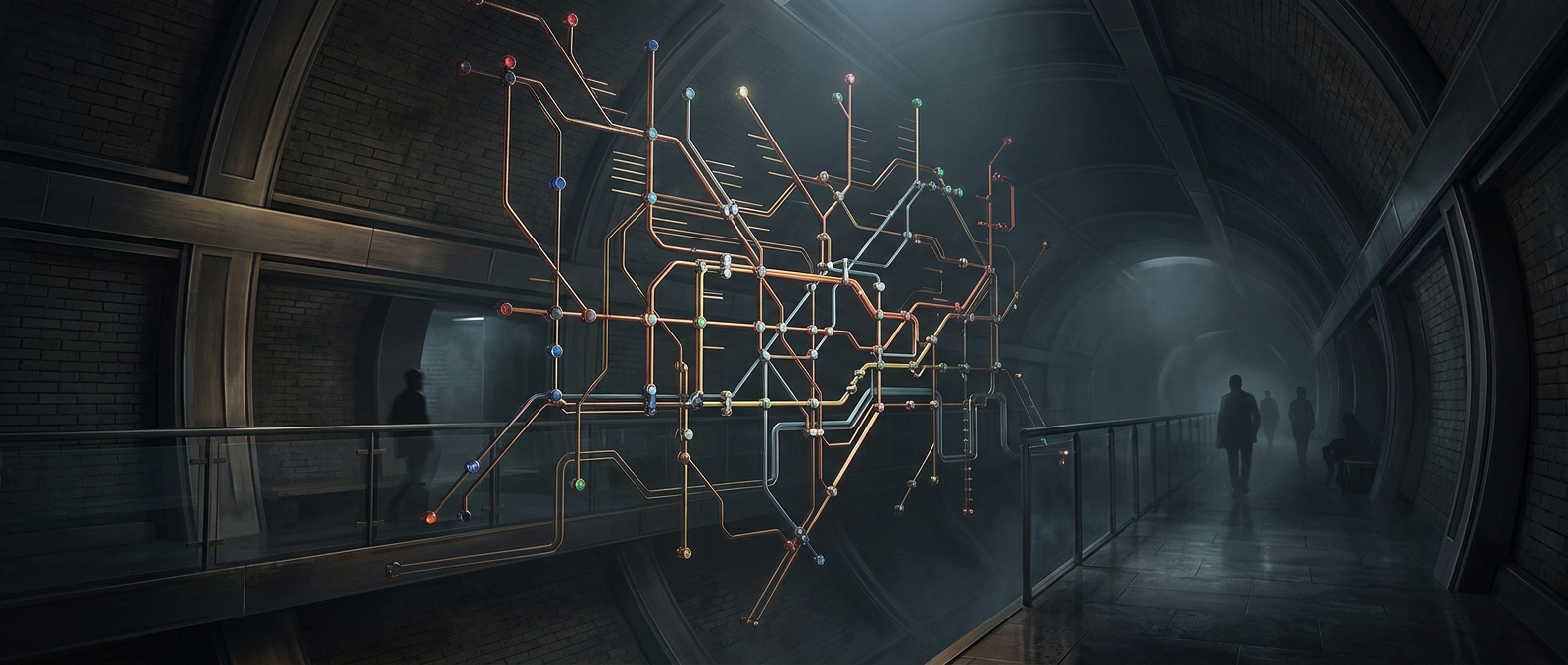
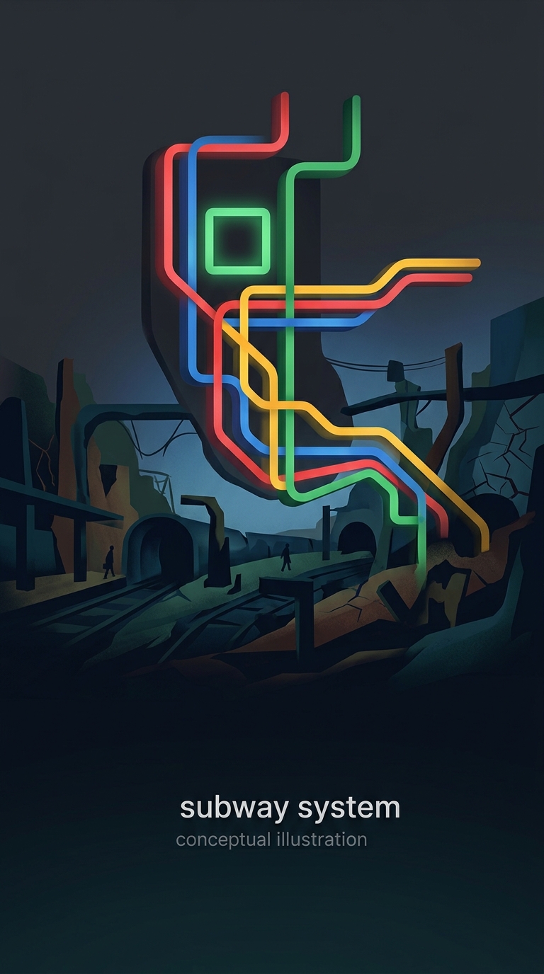
New York subway maps used today are loosely based on a legendary 1972 design by Massimo Vignelli, who chose to sacrifice geographical accuracy for the sake of clean aesthetics and color-coded lines. Vignelli famously depicted Central Park as a square instead of a rectangle and completely ignored the actual scale of the boroughs because he believed commuters only cared about how to get from point A to point B. New Yorkers, being predictably furious about everything, complained endlessly that the map did not accurately reflect the dirty, chaotic streets above ground, forcing the transit authority to replace it a few years later. The man gave them a beautifully simplified piece of modernist art that made navigating the subterranean filth incredibly easy, and they rejected it because the cartoon park was the wrong shape. Now we rely on GPS apps that actively track our miserable locations in real-time, completely erasing the need for any beautiful cartography