Why Subtitle Boxes Are Usually Black
A subtitle has to remain readable over whatever happens behind it: a bright sky, a dark cave, flashing effects, or a character’s face. White lettering can disappear against pale scenery, while dark lettering can vanish into shadows. A solid black background gives the text a stable contrast regardless of the image beneath it.
This is more reliable than relying on an outline or drop shadow alone. Those treatments can help separate letters from the picture, but they may not be enough when the background is busy or changes quickly. An opaque box also makes the text easier to follow for players with low vision or who are watching on a small, dim, or distant display.
Readability Takes Up Screen Space
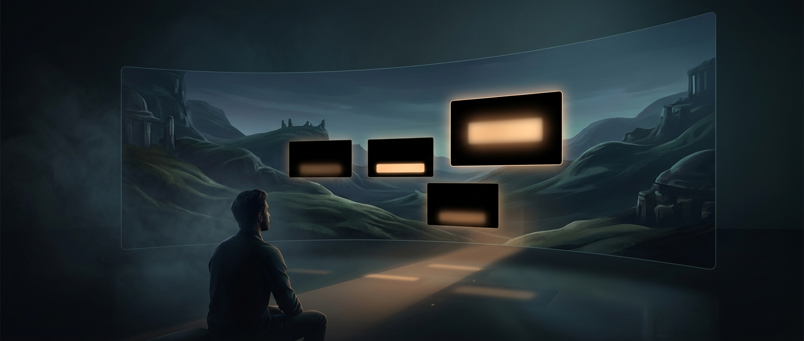
The same coverage that protects the words can hide what is happening in the scene. A subtitle panel may overlap a character, a clue near the bottom of the frame, or an important interface element. If the lines wrap or the box has generous spacing, the covered area grows; in some layouts, it can take up a substantial part of the screen.
That is the design tradeoff: dependable contrast versus an unobstructed view. Where a game offers subtitle settings, changing the background’s opacity or size can preserve more of the image, but a more transparent panel also lets scene details compete with the text. The black rectangle is not merely decoration—it is a deliberate piece of screen space reserved so the dialogue stays legible.