Why a white signal could give the wrong answer
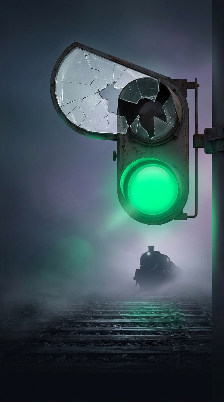
Early railway signals often used a white light to mean “proceed.” It was bright and easy to see, but it had a dangerous weakness: white was also what a lamp showed if its colored glass was missing or broken. A signal meant to say “stop” could therefore appear clear to a driver approaching in the dark.
White lights could also be confused with other lights in the landscape, such as lamps or bright points in the sky. On a railway, a signal had to stand out not merely as visible, but as unmistakably part of the signaling system.
Color made the message harder to mistake
Railways increasingly used green for “proceed,” reserving red for “stop” and, in later standardized systems, yellow for caution. A green lens gave a signal a distinct appearance that ordinary white lights did not share. It also reduced the risk that a missing red lens would turn a stop indication into something that looked like permission to go.
The change was part of a broader effort to make signals communicate reliably in poor visibility and under failure—not just when every component worked perfectly. Signal colors and their meanings were adopted over time rather than switched everywhere at once, so practices varied among railways and eras.
The key safety principle was simple: a signal should not accidentally look safer than it is. Replacing white with green helped make “proceed” a deliberate, recognizable indication rather than the default appearance of an unfiltered lamp.