The SNES version made blood read as sweat
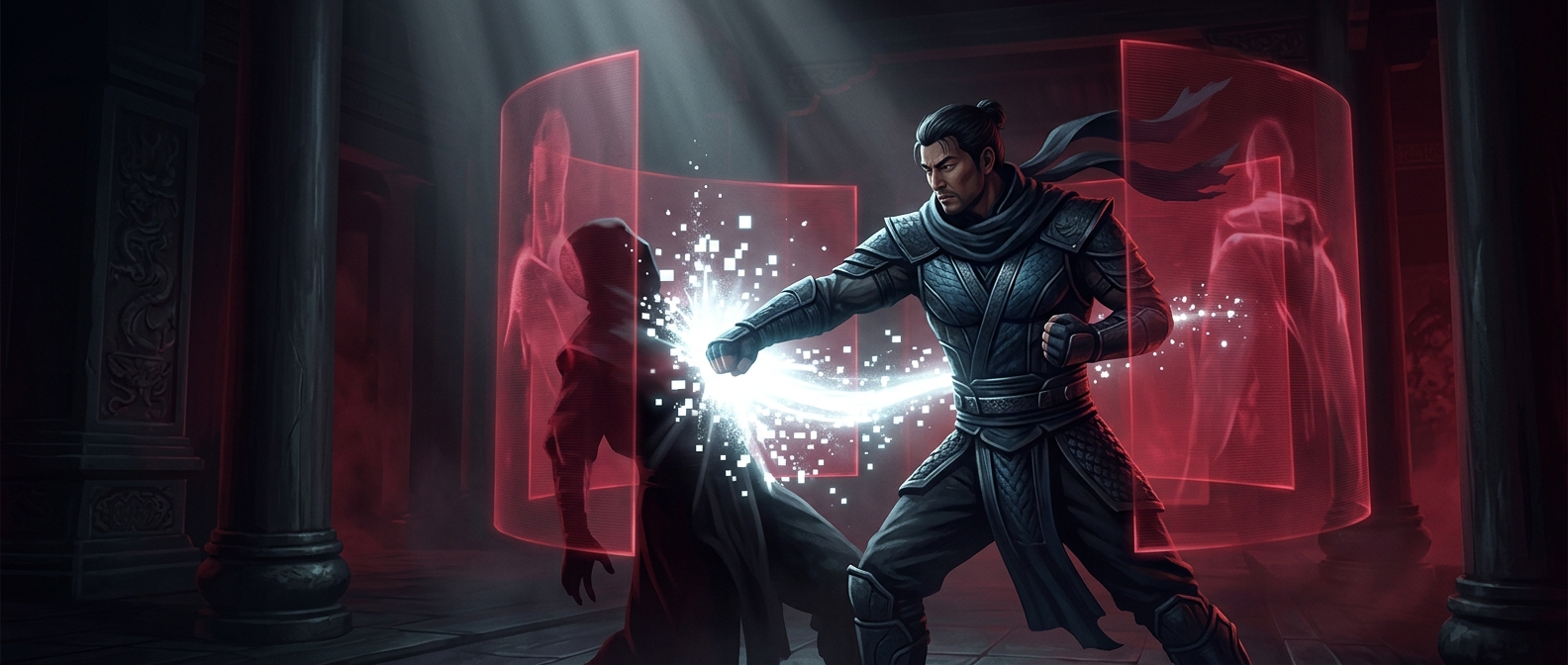
In Mortal Kombat, the gray splashes on Nintendo’s Super Nintendo version were a visible sign of a larger compromise: the game’s violence had been toned down to fit Nintendo’s family-friendly image. Red blood would have made the impact unmistakable. Gray droplets instead looked more like sweat, softening the scene without removing every hit effect.
That change mattered because Mortal Kombat built much of its identity around unusually graphic combat. Its finishing moves, called Fatalities, let players defeat an opponent with a dramatic final attack. On the SNES, those sequences were also altered or removed, so recoloring the splashes was only one part of reshaping the experience.
One game, different rules by console
The arcade original had established players’ expectations, but home versions were made for platforms with different standards. Nintendo’s approach prioritized a less graphic presentation, while the competing Sega Genesis release kept red blood and more of the original violence. The contrast made the gray especially noticeable: players could see that it was not simply an artistic choice shared by every version.
The workaround preserved the rhythm and visual feedback of combat—the screen still showed something at the moment of impact—while changing what that effect suggested. It is a small example of how a platform holder’s content rules could shape not just whether a game appeared on a console, but the meaning of a few pixels on screen.