Why the drawings look unlike real life
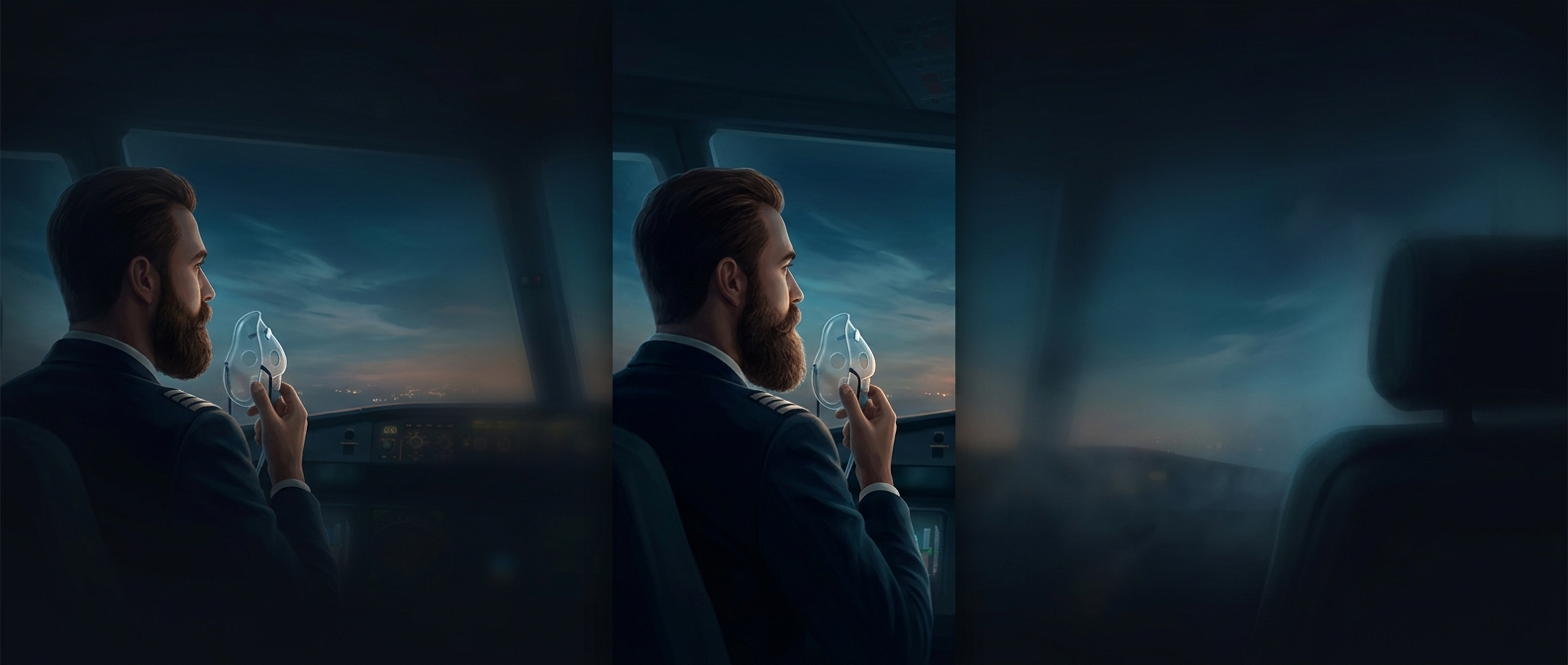
A safety card has to teach an action at a glance, often to someone who has never seen that aircraft’s cabin before. A simplified drawing can isolate the crucial movement—pulling a mask toward the face, fastening a belt, or moving toward an exit—without the visual clutter of a realistic scene. Exaggerated poses and clear outlines make hands, equipment, and direction easier to pick out.
That simplification also helps the instructions travel across languages. A passenger does not need to translate a sentence before recognizing a person leaving a seat or following an exit marker. The pictures are not a universal code, though: labels, arrows, and the aircraft’s own layout help explain what each symbol means.
Designed for a crowded, unfamiliar cabin
In an emergency, people may be startled, the cabin may be noisy or dim, and several instructions may compete for attention. A card therefore breaks actions into separate, ordered scenes instead of asking readers to absorb a dense paragraph. Bright colors can distinguish important objects—such as a mask or exit—from the background, while repeated shapes and simple compositions make the sequence easier to scan.
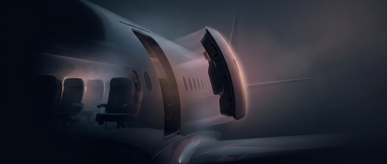
The cartoon quality is functional, not comic. A realistic image could add detail without making the next step clearer; a stripped-down drawing makes the intended action stand out. The aim is not to make danger seem harmless, but to make the right movement recognizable before there is time to read much. That is why a small card can show a person’s posture and the location of an exit more quickly than a block of translated text.