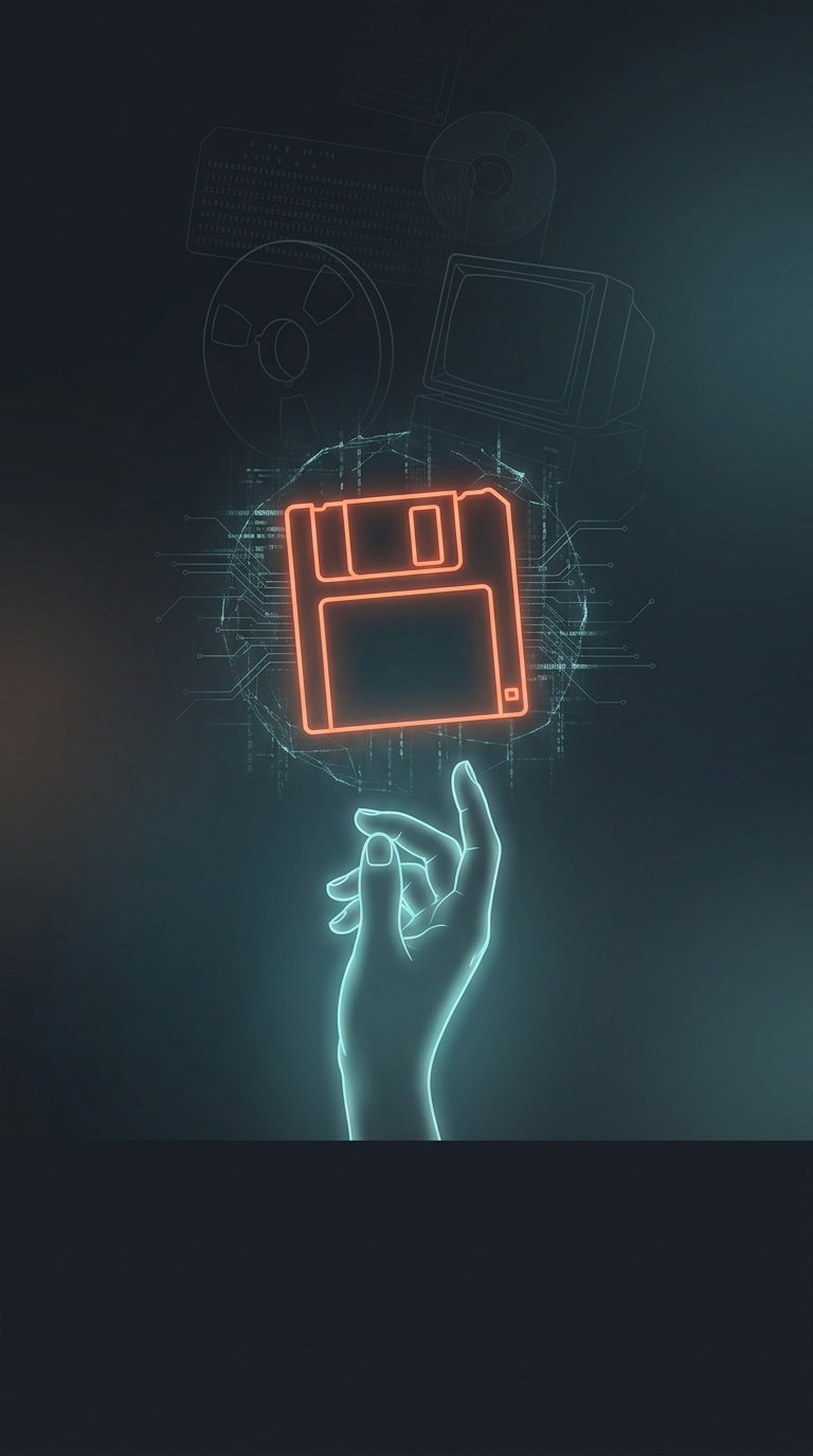
A Save Button From Another Era
The familiar Save symbol on many apps is a small, square floppy disk. It once had a direct, practical meaning: the disk was removable storage, and its label could be used to identify what had been saved. As computers changed, the picture stayed—even after floppy disks disappeared from everyday use.
That persistence is a form of interface inheritance: designers keep a symbol because people recognize it, even when its original object is no longer familiar. The icon can still work as a learned convention, much like a road sign whose shape matters more than the object it depicts. But recognition is not guaranteed for someone who has never encountered a floppy disk.
When the Metaphor Outlives the Object
This creates an awkward problem for technology education. A symbol meant to make software easier can become another thing learners must memorize without understanding. Teachers may need to explain both the action—saving changes so they remain available later—and the historical object represented by the icon. Otherwise, the button risks teaching a visual habit rather than a clear concept.
Replacing the image is not an easy fix: a plain word such as “Save” may be clearer, but icons can be quicker to scan and may fit compact interfaces. The irony is that a tool designed to preserve work also preserves a fragment of computer history. The floppy disk remains legible to many users, but its meaning increasingly has to be taught.