Infinite scroll was built to remove a small interruption
Aza Raskin, the designer credited with creating infinite scroll, has said his biggest regret was that the feature made it easier for people to lose track of time online. In a conventional feed, reaching the bottom creates a natural pause: the reader must choose whether to stop or load another page. Infinite scroll removes that decision point by loading more material as someone moves down the screen.
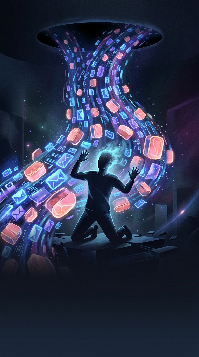
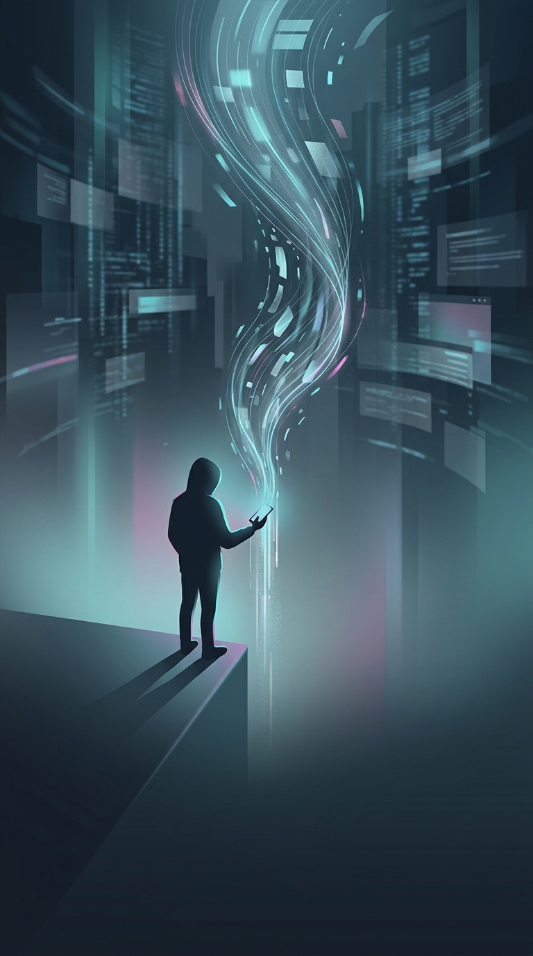
That change seems minor, but it alters the rhythm of browsing. A page break is a stopping cue; without it, each new set of posts arrives before the user has to make a fresh choice. The experience can become less like opening a series of pages and more like following a stream that never visibly ends.
A design convenience became an attention mechanism
The feature solved a real usability problem. On a phone, tapping “next” or waiting for a new page can interrupt reading, especially when someone is scanning a long list of results or updates. Automatically adding the next items makes that activity feel continuous and quick.
But continuity also makes it harder to notice how much time has passed. There is no final screen to signal completion, and the next item is already available. That does not mean every user will keep scrolling, or that the interface alone determines anyone’s behavior. It does mean the design removes one ordinary moment when a person might stop and reconsider.
The regret is about the missing pause
Raskin’s concern points to a broader design tradeoff: reducing friction can make a product more convenient while also weakening the cues that help people regulate their attention. The same feature that lets someone browse without interruption can turn “one more item” into an indefinite sequence.
The practical consequence is easy to recognize: with a paginated list, stopping arrives as part of the interface; with infinite scroll, stopping has to come from the user.