A swipe made the screen feel like a cutting board
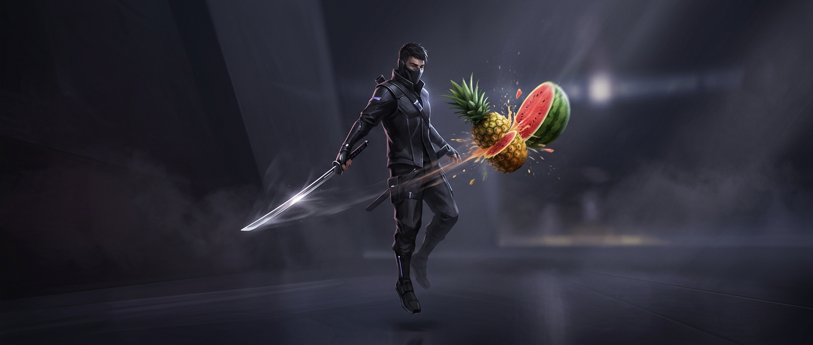
Fruit Ninja’s central design choice was to make the player’s hand movement the attack. Instead of steering a character or tapping a weapon button, you dragged a finger through fruit as it crossed the screen. The gesture was easy to understand at a glance, but it still demanded timing: swipe too early or too late and the fruit escaped.
That direct connection between movement and result made each cut feel immediate. A single swipe could pass through several pieces at once, rewarding players who watched the fruit’s paths and chose a well-timed arc rather than simply scribbling across the display.
The bomb gave every swipe a cost
The bombs changed the meaning of that simple gesture. Fruit invited a broad, fast cut; a bomb made the same movement dangerous. Players had to identify what was on screen before committing their finger, turning reflex into a small decision: take the available fruit, or risk a swipe that might catch something else.
That tension also made the game’s short sessions work. There was no elaborate control scheme to relearn between attempts, and a round could end quickly when a player made a costly mistake. The result was a loop that was easy to start but not entirely mindless: every burst of fruit offered a fresh chance to score, while every bomb tested whether speed had outrun attention.