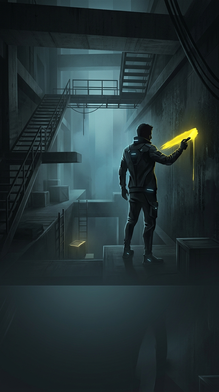
Yellow paint turns scenery into a readable route
A ledge can be part of the background or a place the player is meant to grab. Yellow paint helps make that distinction quickly. When the same bright color appears on a ladder rung, a crate edge, or a handhold, players learn to treat it as a visual cue: look here, and this may be a route forward.
That matters because games ask players to read a scene while moving, often under time pressure. A small painted strip can guide a jump without an arrow, button prompt, or glowing outline covering the environment. The cue feels built into the world—paint on concrete or metal—while still serving the practical job of steering attention.
A design shortcut with tradeoffs
Yellow is useful because it often stands out against darker, muted surroundings. Repeating it also creates consistency: once players recognize the signal, a new yellow-marked surface is easier to understand. Designers can therefore use color to make a route legible before the player reaches it, reducing missed jumps and aimless searching.
But the paint is not magic. A yellow surface can disappear against a bright background, and color alone may not work for every player. Shape, lighting, placement, and animation can reinforce the message; accessibility options may also provide other ways to distinguish important features. The strongest visual cues are readable for more than one reason.
The tradeoff is that repeated yellow markings can make fictional spaces feel less natural—or make routes feel overly obvious. Yet when a player spots a yellow stripe and instinctively knows where to climb, a tiny patch of paint has quietly replaced a much louder instruction.