The eye does not bring every color into focus alike
White light contains different wavelengths, and the eye’s lens bends them by slightly different amounts. This is called chromatic aberration: blue light tends to come to focus a little nearer the lens than red light does. The retina is a curved surface, not a flat screen positioned at one perfect focal distance, so a small mismatch in focus can leave color edges with different degrees of sharpness.
The eye also forms colored edges in slightly different positions. Those tiny shifts, shaped by the way light passes through the pupil, can give the visual system a hint that one color lies in front of another. The brain normally treats these optical imperfections as minor; under the right conditions, they become noticeable as depth.
Why a flat print can seem layered
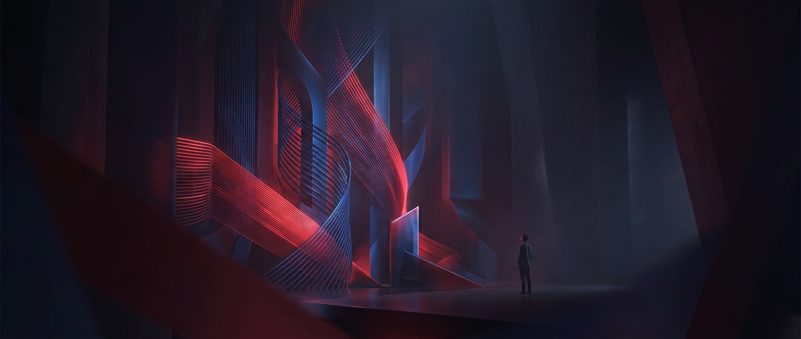
Put vivid red and blue next to each other, especially in crisp lettering or narrow stripes, and the contrast makes the shifted edges easy to see. The colors are still on the same surface, but your eyes receive subtly different signals from them. The brain uses those signals alongside focus and other visual cues to judge where things are, and may interpret the mismatch as separation in depth.
The effect is not equally strong for everyone or in every arrangement. It can change with the colors, the size and spacing of the shapes, the lighting, and the optics of an individual’s eyes. Often red seems closer than blue, but the impression is not a dependable measurement of distance. It is a useful reminder that depth is something the visual system infers—even when the object being judged is an entirely flat page.