How a Comic Page Turns Crisis Into Momentum
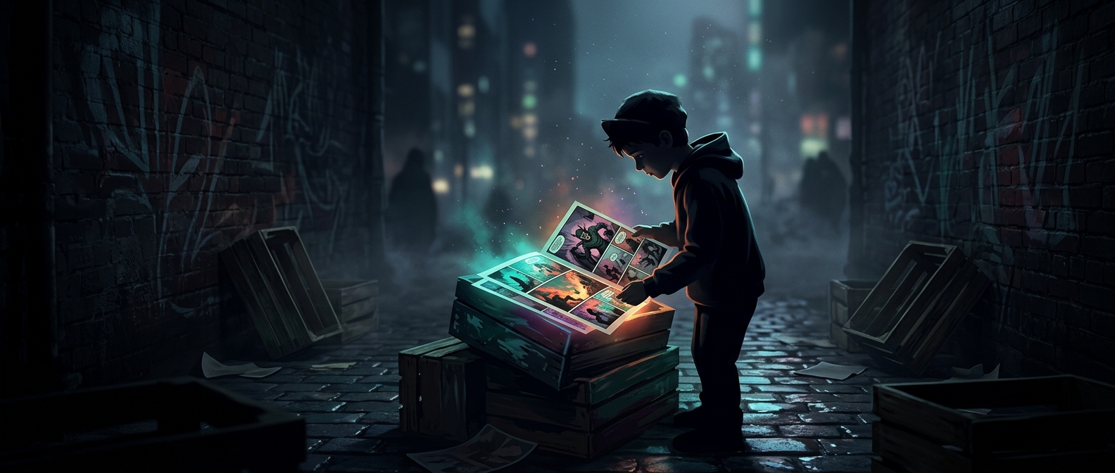
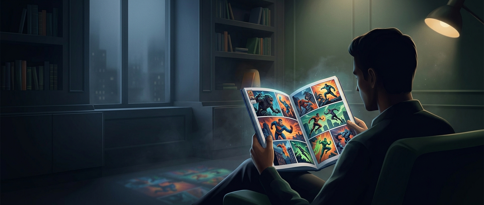
A superhero comic has to make a huge threat legible in a small space. The artist and writer cannot linger over every collapsing city or explain every power from scratch. Instead, they choose a few visual beats that let the reader fill in the motion: a warning, a sudden impact, a reaction, and a new complication.
The page itself helps control the pace. A large panel can make a reveal or blow feel momentous because it takes up more of the reader’s attention. A row of smaller panels can stretch out a brief exchange, letting a pause or a sequence of movements land one beat at a time. The reader’s eye supplies the transition between images, so a single panel can imply action that would take many seconds on screen.
The Ending Has to Do More Than End
A short issue usually needs to deliver a satisfying turn while also leaving room for the larger story to continue. That creates a design tradeoff: resolve the immediate danger too neatly, and the ongoing plot loses momentum; end before anything changes, and the issue can feel like setup rather than a story. A fight’s outcome, a surprise arrival, or a newly revealed cost can provide closure and open the next problem at once.
The most effective finale may therefore be a punch, but the punch is only the visible payoff. The pages before it have taught readers what is at stake, who can be hurt, and what winning might cost. Compression works when every image advances both the action and the reader’s understanding of it.