Why Early ATMs Looked Like Bank Furniture
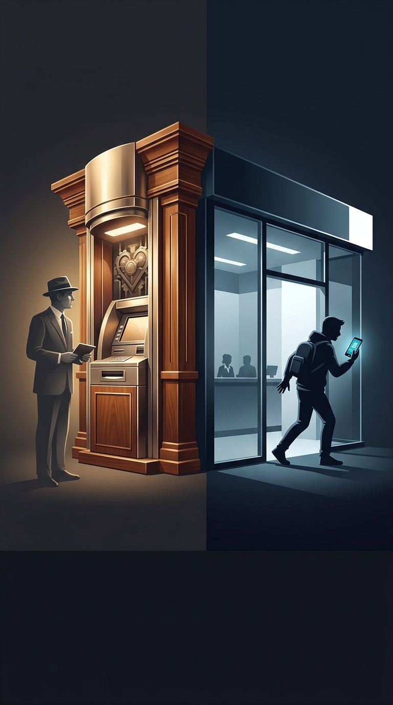
A machine asking people to trust it with money had a problem that modern screens rarely face: customers could not yet take for granted that a bank would let a mechanism handle a transaction without a person present. In the 1960s, automated teller machines were novel enough that their appearance helped explain what they were supposed to be. Wood paneling and polished metal connected unfamiliar machinery to the established visual language of a bank—solid, finished, and expensive-looking.
That finish was more than decoration. A bare box of buttons and moving parts might suggest a vending machine, or invite doubts about whether the device was secure and officially connected to the bank. A carefully finished casing made the machine look like part of the institution rather than an improvised gadget. The design offered a visual promise of legitimacy before customers had experience to judge the technology by.
Trust Had to Be Designed In
Using an ATM meant accepting a new division of labor: the customer operated the machine, while the bank’s systems had to recognize the customer and record the transaction correctly. The machine’s exterior could not prove that this would work, but it could make the unfamiliar process feel less like a leap into the unknown. Its polished surfaces and bank-like materials gave customers familiar cues at the moment they were being asked to try something unfamiliar.
As automated banking became ordinary, those cues mattered less. Customers learned what ATMs did through repeated use, and machines could be designed around practical needs such as visibility, durability, and access. The contrast is striking: early machines borrowed the reassuring look of a traditional bank counter to earn trust; now, for many routine transactions, the machine is the familiar option—and the branch visit is the part that can feel like the interruption.