How The Matrix Made Color Part of the Story
In The Matrix, color helps distinguish two worlds before a character explains what either one is. Scenes inside the simulated reality lean green; scenes in the physical world tend toward colder blue and gray. The contrast gives viewers a quick visual cue: the familiar-looking world may be artificial, while the harsher-looking one is real.
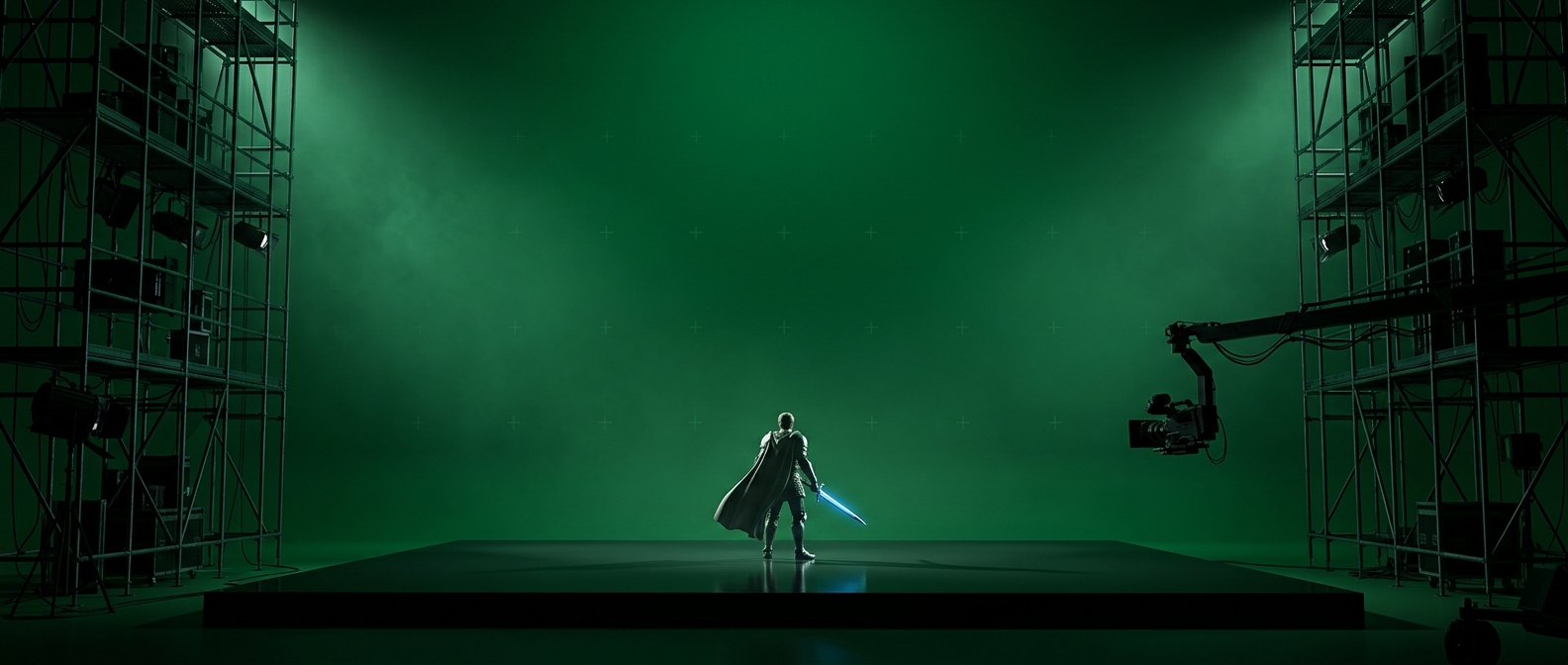
That cue works because color grading—the adjustment of color and tone across a finished image—can make separate shots feel as though they belong to the same environment. A green cast across a scene can suggest that its light, surfaces, and air share a single visual character, even when the footage was filmed under varied conditions.
A Digital World With a Distinctive Look
The green palette also evokes the glow of older computer displays, including monochrome monitors that rendered text in green phosphor. It is not a literal representation of how a computer simulation must look; it is a visual shorthand audiences can recognize. The tint makes the Matrix feel mediated by technology, while the blue-gray palette gives the real world a different, more physical atmosphere.
Because the colors recur, viewers can learn the distinction without stopping to analyze it. The palette quietly organizes the film: a shift in color can signal a change in the kind of world a scene inhabits, reinforcing the story through the image itself.
When Style Carries Information
The lasting lesson is not simply that green looks “digital.” It is that a strong palette can do narrative work when it is consistent and tied to a clear idea. In The Matrix, the color difference helps orient the audience; it is not just decoration laid over the action. That makes the green tint memorable—and gives filmmakers a reminder that visual style is clearest when it helps viewers understand what they are seeing.