A Cover Has Seconds to Make Its Case
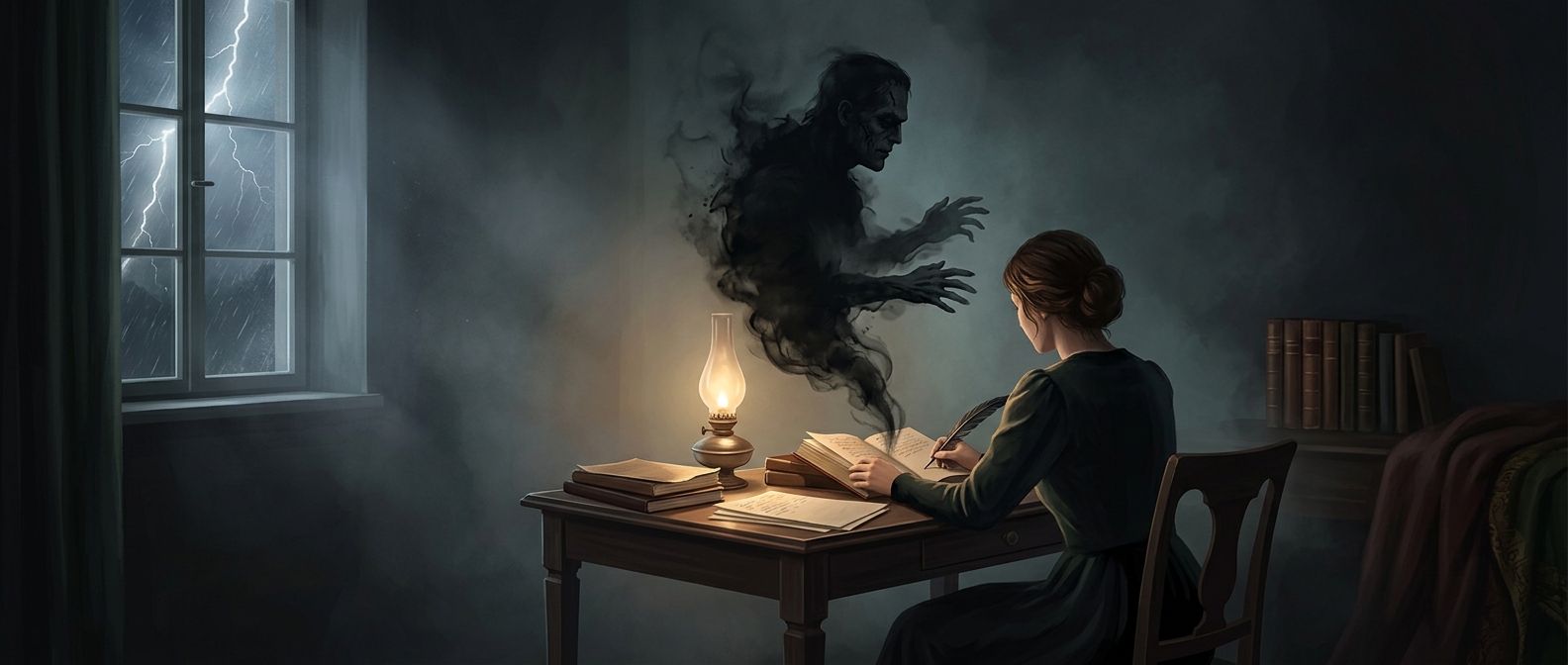
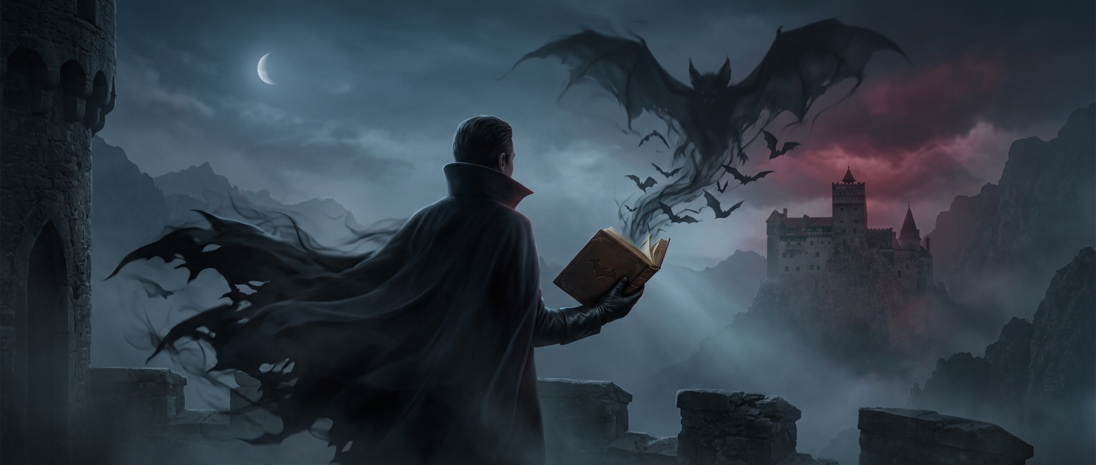
In a bookstore or online catalog, readers often meet a book before they meet its prose. A cover has to communicate at a glance: Is this a thriller, romance, memoir, or something else? Color, lettering, imagery, and layout work together as a fast visual signal. A storm-dark landscape may suggest suspense; elegant script and a couple facing one another may suggest romance. These are conventions, not guarantees, but readers learn to recognize them.
That signal helps people sort through a crowded choice. Someone browsing for a particular mood or genre can use a cover to decide which books deserve a closer look, then turn to the back-cover copy, reviews, or first pages. The jacket is not a substitute for the story; it is an invitation—and a promise about the kind of experience inside.
The Design Has to Work at Different Sizes
A paperback cover must catch attention on a physical shelf, where neighboring books compete for the same glance. It also has to remain legible as a small thumbnail on a phone or website. That creates practical tradeoffs: intricate details may disappear when reduced, while a distinctive title treatment or strong contrast can remain visible. Designers must also make room for the author’s name and other information without crowding the central image.
Recognition Can Bring the Right Reader—or Mislead
Genre cues make browsing easier, but they can also steer expectations. A reader who picks up a book because its design signals a familiar kind of story may feel misled if the contents take a very different direction. A successful cover therefore does more than look striking: it helps the intended audience recognize the book while setting expectations the story can meet. The cover is a compact piece of communication, shaping who stops, what they anticipate, and whether they open the book.