When a Poster Had to Plan the Journey
Before a travel poster became a picture of somewhere worth visiting, it could serve as a practical notice for getting there. A passenger deciding whether to take a train needed usable details: when it left, where it stopped, and how the service fit the day. A wall poster could put that information where travelers were already making plans—at a station or other public place.
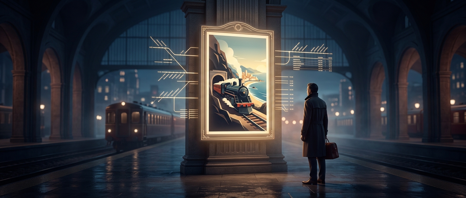
That job shaped the design. Departure times and route details took up space, so the page could read more like a timetable than an invitation. The poster was not merely advertising a destination; it was helping turn a possible trip into a workable one.
From Instructions to Invitation
As railway companies competed for travelers, posters could do more than explain a service. A bold image of a coastline, city, or mountain region could make the destination itself the draw, while a short line of text supplied the practical pitch. Color printing and illustration made that kind of visual appeal easier to deliver at a glance.
The change was not simply a matter of replacing facts with art. A timetable answers, “How do I get there?” An image answers, “Why go?” Travel advertising could use both, but the balance shifted toward making a place memorable rather than listing every departure on the wall.
That shift changed what a passerby was meant to do: not just check a train time, but imagine taking the train somewhere.