A menu designed to feel like an interruption
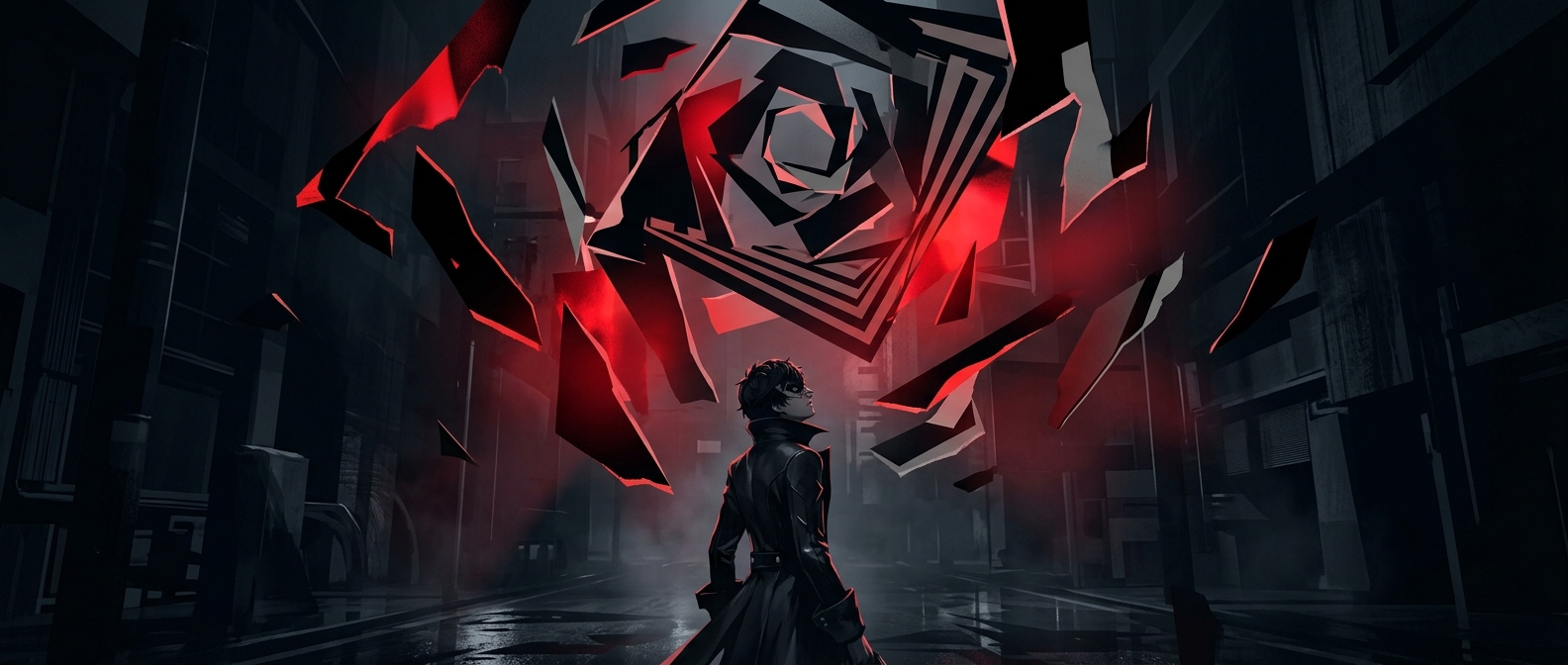
In Persona 5, opening a menu rarely feels like stepping away from the action. The interface snaps into view with tilted panels, abrupt cuts, and lettering that seems assembled from different pieces. That restless style turns a pause to check equipment or items into another beat of the game’s drama.
The effect comes from treating the interface as part of the visual storytelling, not as a neutral layer placed over it. The game follows a group of young thieves, and its menus borrow the energy of a bold, disruptive graphic poster. Their jagged shapes and uneven typography suggest a world being challenged rather than calmly navigated.
Chaos with a usable structure
A ransom-note look could easily make information hard to find. The design avoids that by keeping the disorder mostly in the presentation: menu categories still occupy recognizable places, and strong contrast helps separate text from backgrounds. Players can scan for a command even as the panels move and the composition refuses to sit still.
That distinction matters. If every label were equally crooked, crowded, or difficult to read, the style would become friction. Instead, motion and shape supply attitude while the menu’s organization does the practical work. The result is an interface that feels unruly without making every choice a puzzle.
Routine actions become part of the performance
The menus also keep the game’s tone consistent during small tasks. Selecting an item or reviewing a character does not have to interrupt the sense of momentum; the interface itself performs that momentum through its sharp transitions and graphic emphasis.
That is why the look is more than decoration. It makes the act of navigating feel like an extension of the game’s rebellious identity—so even an inventory check arrives with a little theatrical flair.