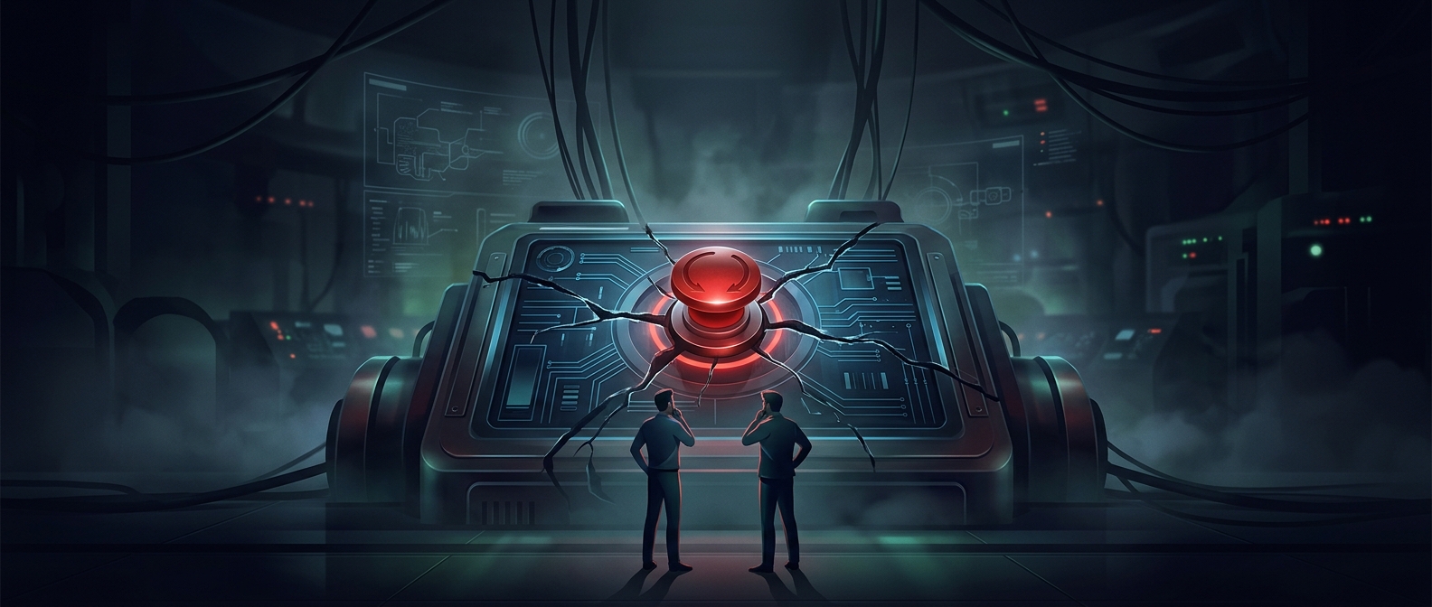
How Interface Choices Steer Decisions
A button is not just a way to carry out a decision; its placement and wording can shape which decision feels easiest. A service might make “accept” prominent while hiding “decline” in a settings menu, or leave a paid renewal selected by default. The user can still choose otherwise, but the extra steps and friction make one outcome more likely.
Designers call some of these tactics dark patterns: interface choices that push people toward actions they might not take if the options were presented clearly and evenly. A free trial that automatically becomes a paid subscription is not inherently deceptive if the renewal terms are plain and cancellation is straightforward. The ethical problem grows when important terms are easy to miss, or when signing up takes one click but getting out requires a confusing sequence.
Privacy Depends on Who Gets to Choose
Read receipts show the other side of the same design problem. They reveal whether a message has been opened, which can help people coordinate—but can also create pressure to respond immediately. A setting that lets users turn them off gives them control over what information they disclose and when.
The crucial difference is not whether a feature influences behavior; nearly every interface does. It is whether people can understand what is happening and make a meaningful choice. A clear, reversible setting supports agency. A hidden default or deliberately cumbersome exit can take advantage of inattention, time pressure, or social expectations.
The Consequences Are Small—and Cumulative
These choices rarely resemble physical surveillance: no camera needs to record someone. Instead, a service can shape behavior by deciding what information to display, what action takes the least effort, and what data to make visible to others. That influence matters most when users cannot readily see or resist it.
One extra cancellation step may seem trivial. Repeated across services, such friction can leave people paying for subscriptions they no longer want, while routine visibility features can make them feel constantly answerable. The practical test is simple: Can a person tell what the design will do, and can they change their mind without undue effort?