A color change that altered the character’s read
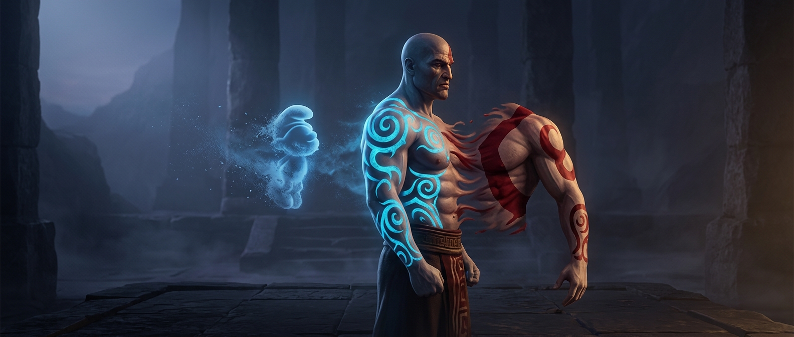
A character’s paint is more than decoration: it becomes part of the quick visual shorthand players use to recognize him. During God of War’s early development, Kratos’s blue war paint created an unintended comparison—to a Smurf or to the barbarian from Diablo II. Once the resemblance was noticeable, the team changed the paint to red.
That is a small example of a practical design problem: an idea can work on its own and still feel wrong when it brings another character to mind. The issue was not whether blue paint made sense in isolation, but what the finished combination suggested to people looking at Kratos.
Why the first impression mattered
Players often meet a game character first through a brief glimpse—a pose, a face, or a figure against a busy background. Color helps that image register quickly, but it also carries associations from other games and familiar characters. If those associations pull attention elsewhere, the design may lose some of its distinctiveness.
Changing the paint to red gave the team a way to escape the comparison while keeping war paint as part of Kratos’s look. The episode shows how a memorable character design can turn on a seemingly small choice: not just what a feature is, but what it makes the whole character resemble.