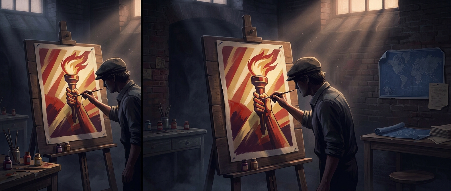
A message built for a moving audience
A wartime poster competed with the ordinary distractions of a street, station, or shop window. Its viewer might glance up for only a moment, so the design had to establish what mattered first: a striking image, a few large words, and a clear emotional direction. Small print could explain details, but it could not carry the main argument.
That hierarchy made the poster work almost like a visual sentence. A face, flag, uniform, or other familiar symbol supplied context quickly; color and scale guided the eye; and a short appeal connected the image to an action or attitude. The viewer did not need to read every line to grasp whether the message was urging resolve, warning of danger, or asking for loyalty.
Emotion made the appeal memorable
The images did more than decorate the words. They gave abstract stakes—such as duty or threat—a recognizable form. A person shown as vulnerable could make danger feel immediate; a confident figure could make participation look honorable. These choices framed how viewers were meant to interpret the conflict, turning a complicated situation into a simple emotional contrast.
That simplicity was persuasive, but it also left little room for nuance. A poster could make one response feel obvious while leaving out competing perspectives or practical complications. Its power came partly from that compression: a fast impression could shape a viewer’s sense of what was happening and what a good citizen should do next.
From glance to public behavior
Posters were especially useful because they could repeat the same appeal in shared spaces, reaching people who might not seek out a speech or a newspaper article. Repetition helped a message become familiar, while the public setting made it visible as part of everyday life. The result was not simply an image that explained a policy; it was a small, repeatable prompt aimed at influencing choices and attitudes wherever people passed by.