Color turns a place into an invitation
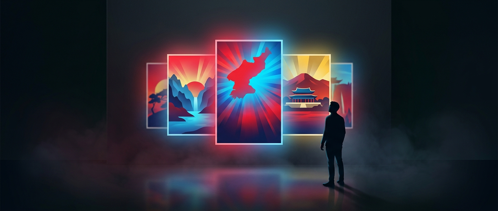
A travel poster has only a moment to catch the eye. Saturated color helps: vivid reds stand out, while a bright sky can make the scene feel open and welcoming. These choices guide attention before a viewer has time to inspect the details. Color is not just a description of the landscape; it sets the emotional terms for seeing it.
Why the scene feels polished
In an ordinary snapshot, lighting may be uneven, colors muted, and small distractions hard to avoid. A designed image can simplify that visual clutter. Strong hues and clean contrasts make the most appealing parts of a scene easier to notice, while the image’s overall harmony gives it a finished, almost timeless quality. The result can feel nostalgic without depicting any particular memory: it resembles an idealized image of a place rather than a record of one moment there.
An ideal is part of the message
That effect matters in North Korean travel posters because the image is doing more than locating a destination. Its polished mood helps present travel as attractive and the place as worth imagining. The colors work alongside the subject and composition to make that invitation persuasive. A viewer may register the bright sky or red accents first, but the deeper impression is that the scene has been arranged to feel welcoming.