The route turns browsing into discovery
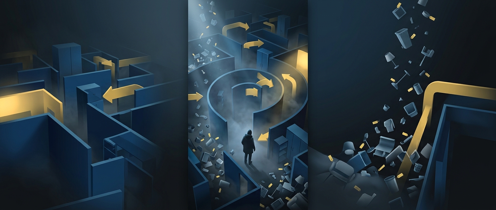
A big-box furniture store has a problem ordinary shops do not: most of its inventory is difficult to imagine in isolation. A sofa on a warehouse shelf says little about how it might look in a living room. IKEA’s showroom addresses that by arranging products in furnished rooms and leading shoppers past them in a planned sequence.
That route also increases the number of things a visitor sees. Someone who arrives for a desk may pass lighting, storage, kitchenware, and accessories along the way. The commercial logic is straightforward: more exposure creates more chances for an unplanned purchase, while room displays make related items feel useful together.
Why the path feels hard to escape
A continuous route is easier for a retailer to manage than a sprawling floor where every visitor chooses a different path. It guides foot traffic through the showroom, helps shoppers find departments in a predictable order, and makes the space feel like a series of complete home ideas rather than a collection of disconnected products.
The layout is not necessarily a trap. Stores typically provide shortcuts or ways to move between sections, and shoppers can skip the showroom when they know what they want. But those alternatives require noticing signs or choosing to leave the main route; the default path keeps presenting new displays.
The tradeoff for shoppers
The same design that encourages discovery can cost time, especially for a visitor with a short list. In effect, the store trades a direct trip to one product for a guided tour of many possibilities. That can be useful when someone is furnishing a room from scratch—and frustrating when they only need a replacement part.
The maze works because it makes shopping itself part of the sales presentation: before reaching the item they came for, customers have already seen how many other things might belong in the same home.