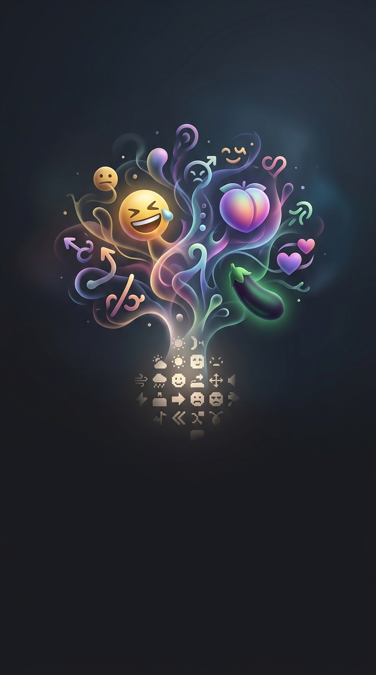
Why the First Emoji Had to Fit in a Tiny Grid
In 1999, Japanese mobile provider NTT DoCoMo offered a service for sending short messages and receiving updates such as weather forecasts. The screens were small, and messages had strict limits on how much text they could contain. That left little room for tone: a forecast could say it would rain, but not easily convey whether the news felt gloomy, playful, or reassuring.
Interface designer Shigetaka Kurita addressed that problem with a set of 176 small images. Each occupied a grid just 12 pixels wide and 12 pixels high—so small that every mark had to carry its weight. The constraint was not merely visual. It shaped what the symbols could communicate.
How a Few Pixels Carried Meaning
At that resolution, detail quickly disappears. A face could not rely on subtle shading or elaborate features; a simple outline and a few marks had to suggest an expression at a glance. The same principle applied to symbols for weather, transport, and other everyday topics: recognizable shapes mattered more than decoration.
The images gave users a way to add context without spending scarce characters. A forecast accompanied by a sun or rain symbol was easier to scan, while an expressive face could soften or color a short message. The key innovation was turning a cramped screen into a shared visual vocabulary.
From Interface Constraint to Everyday Language
Kurita’s original set belonged to a particular mobile service, but the idea proved adaptable: small images could carry tone and meaning across text-based communication. Later emoji systems grew far beyond that initial grid and set, yet the design challenge remains familiar. On a screen, a compact symbol can do what a sentence sometimes cannot—show how a message is meant to feel.