Why Gotham’s darkness began as the page
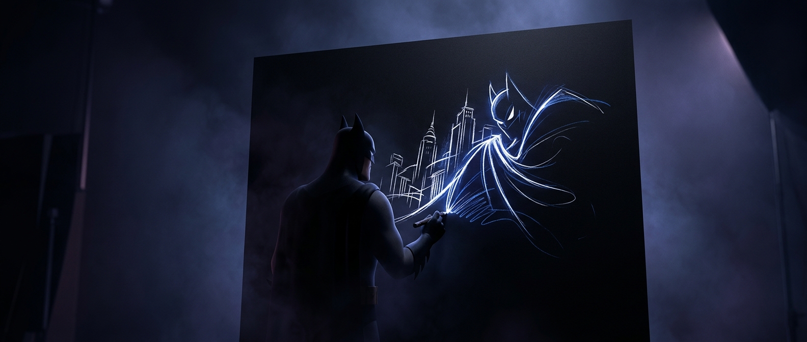
For Batman: The Animated Series, background artists could start with black paper instead of covering a light surface with dark paint. That simple reversal changed the work’s basic question: rather than asking how to make a scene look dark, artists could decide where light should break through.
They added painted color to the black, using illuminated windows, streetlamps, signs, and edges of buildings to pick out forms. Unpainted areas stayed dark. The result could make a city block feel as if it emerged from shadow, with only a few bright details telling the viewer where to look.
A production method that became a visual style
This approach suited the series’ film-noir influence—noir being a crime-story style known for dramatic shadows and sharp contrasts. Gotham’s backgrounds often read less like evenly lit locations and more like fragments caught in a beam of light. The darkness was not merely scenery; it shaped the mood and guided attention toward Batman, a doorway, or a patch of danger.
Because animated characters were drawn and painted separately from the backgrounds, the dark settings also gave their silhouettes a strong field to stand against. A figure could register clearly without the city needing to be brightly illuminated. The technique made the production choice and the storytelling choice reinforce each other: black paper saved artists from having to paint darkness everywhere, while leaving them room to make every patch of light count.