Why Freddy’s Sweater Feels Visually Wrong
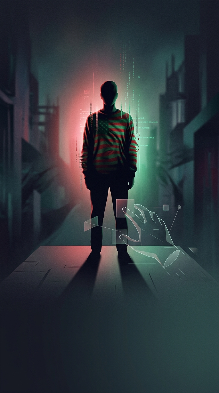
Freddy Krueger’s red-and-green stripes were chosen to make him unsettling before he even moved. The colors are familiar—both turn up in ordinary clothes and holiday decorations—but side by side they can feel jarring. That tension gives the sweater a slightly off-kilter quality, fitting a character who enters dreams and makes the everyday feel unsafe.
The choice is often linked to a claim about human vision: that red and green together are especially difficult for the eye to process. There is a real perceptual idea behind the effect, but it is not that the colors confuse everyone’s eyesight. Red and green are opposing signals in the visual system, and strong versions placed next to each other can create a harsh, vibrating edge. The exact effect depends on the shades, lighting, and viewer.
A Small Design Choice With a Lasting Effect
The sweater also works because its stripes are simple and instantly recognizable. A monster’s costume has to read clearly in dim scenes and at a glance; alternating bands do that without needing elaborate detail. The color clash adds unease, while the repeated pattern makes the figure easy to remember.
That combination is the useful point: the sweater does not rely on a secret psychological trick. It turns a familiar color pairing into a visual disturbance, so Freddy’s ordinary-looking clothes help make him feel wrong.