Why a “Do Not Touch” Sign Can Make an Object Harder to Ignore
A strict warning does more than describe a rule: it highlights the very action it forbids. Once a sign says “Do not touch,” touching becomes a vivid possibility. The object is no longer just something to look at; it is something the viewer has been told not to do.
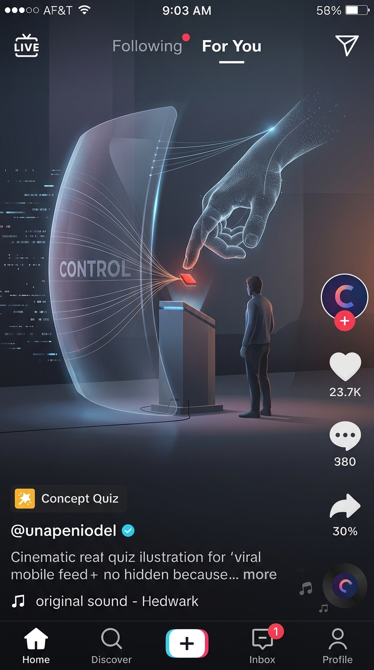
That extra attention can meet psychological reactance—the urge to reclaim a choice when it feels restricted. The effect is usually small, not irresistible: a visitor who already respects the rule may simply keep their hands back. But for someone who feels controlled, or who is curious, the prohibition can make testing the boundary more tempting.
The Sign Also Makes People Wonder What’s There
A warning often hints that the object is unusually delicate, valuable, or interesting. That can prompt questions: What would it feel like? Why is touching it forbidden? Is the rule really necessary? The sign cannot answer those questions, so a quick touch may seem like the easiest way to satisfy curiosity.
The object’s setting matters, too. A display placed within easy reach invites handling in a way that a sealed case does not. If the warning is severe but the object remains accessible, the setup sends two different signals: the words say “stop,” while the layout says “you could.”
A Boundary Works Better When It Gives a Reason
Clear limits are still important, especially around fragile or hazardous objects. But a brief explanation—such as that handling can damage a surface—can make the restriction feel less arbitrary. Physical barriers also remove the easy opportunity to test it.
The memorable twist is that a sign meant to suppress attention can focus it instead. By naming the forbidden action and leaving it within reach, the warning may turn a passing impulse into a small, deliberate test.