A script can make age visible
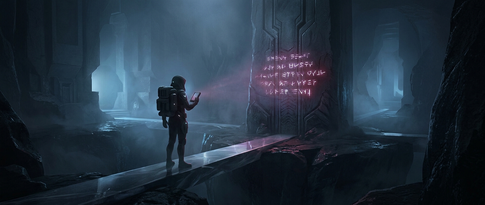
A prophecy is often meant to feel like evidence from a world with a long past, not merely a paragraph of plot information. Unfamiliar letterforms create distance: the viewer can see that the text belongs to another culture or era before anyone explains what it says. Angular strokes, dense lines, and unfamiliar spacing can suggest a writing system with its own rules, while worn surfaces and uneven ink make the object seem to have survived its authors.
That visual distance also gives the text authority. Characters may treat the document as something inherited, guarded, or difficult to interpret; its appearance helps the audience accept that importance before the story supplies the details. The script does not need to be truly ancient. It needs to look as though it carries history within the fictional world.
The design has to serve the scene
Creators face a practical tradeoff: a page should look strange enough to invite questions, but not so opaque that the audience loses track of why it matters. A story can show a few distinctive symbols, then let a character translate or interpret them. That way, the writing remains a visual mystery while the dialogue or action delivers information viewers need.
The same choice shapes how much of the script is actually designed. If a prop appears only in a quick glimpse, a convincing pattern of marks may be enough. If the camera lingers on the page—or the plot depends on a particular symbol—its details must hold together more closely. The script is doing two jobs at once: withholding meaning and making the act of discovering it feel consequential. That is why a prophecy can look like a secret kept for centuries, even when the audience sees only a few lines.