How text becomes a picture
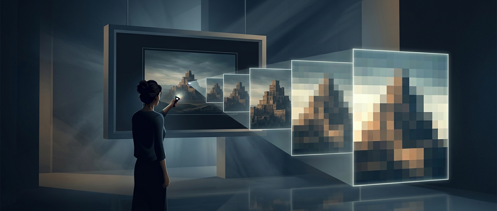
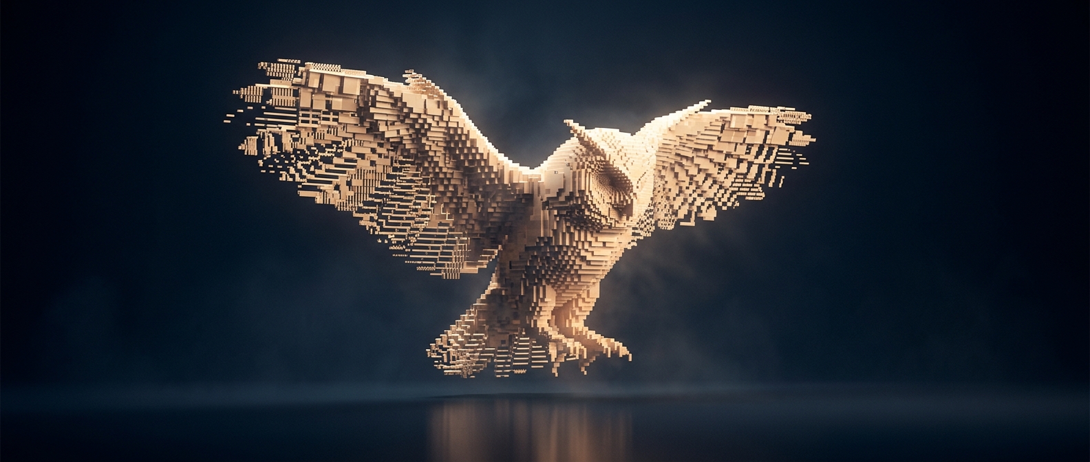
In ASCII art, each character occupies a small position in a grid, much like a tile in a mosaic. The artist uses the character’s shape and visual weight to suggest parts of an image: a period leaves a light mark, while a dense symbol such as `#` creates a darker patch. Repeated across many lines, those marks can outline a face, build shadows, or give a scene texture.
The trick depends on how the characters look together, not what they mean as words. A slash might become the edge of a roof; brackets might trace a rounded form. The viewer’s eye blends the separate marks into a larger image, especially when the text is seen from a little distance.
Why the grid matters
Most ASCII art is designed for a monospaced font, in which every character takes up the same width. That keeps the rows and columns aligned. A proportional font, where an “i” is narrower than a “W,” can shift the marks and distort the picture.
Some artists arrange every character by hand. Others convert an existing image by matching darker areas to heavier-looking symbols and lighter areas to sparse ones. Either way, the limited palette is also the art’s constraint: there are no continuous shades, only discrete marks. A plain text file can therefore carry an image without storing conventional pixels—but the picture remains dependent on the characters and spacing being displayed as intended.