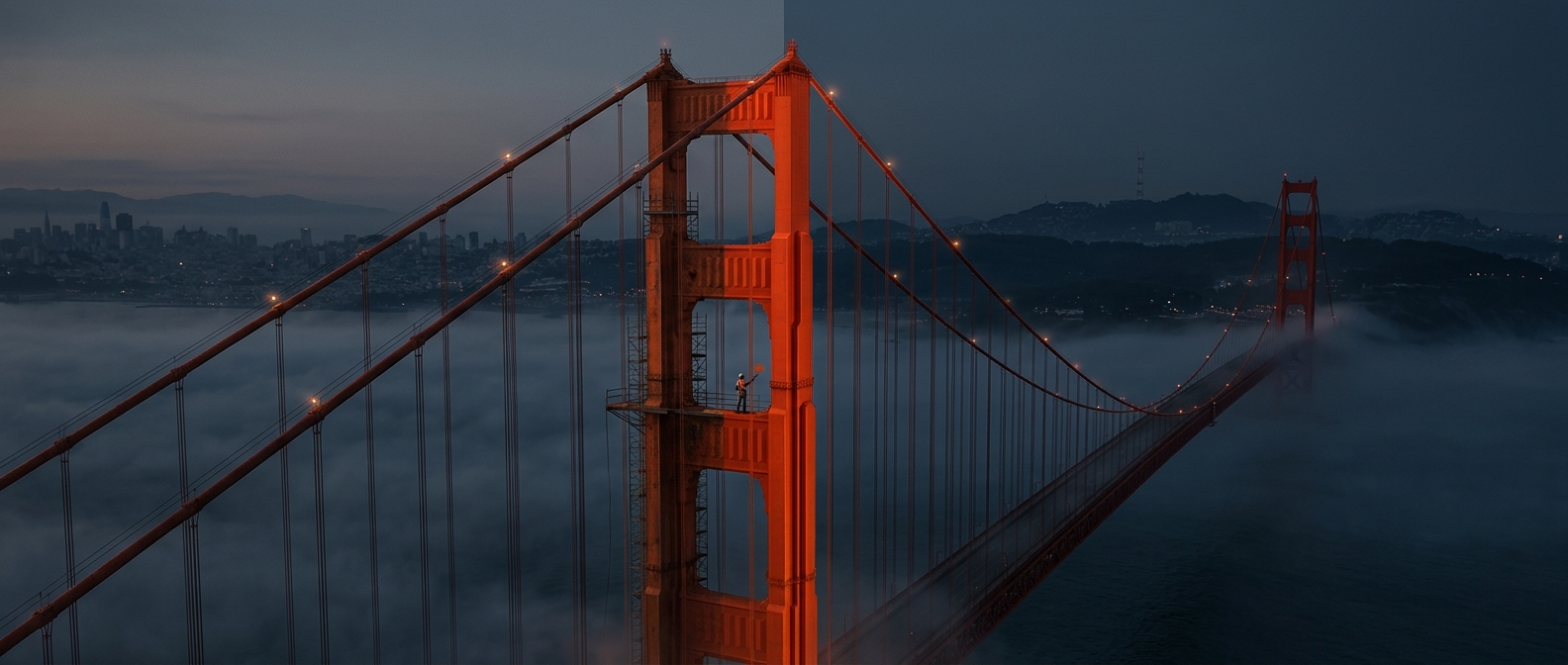
A protective coating became a design choice
When the Golden Gate Bridge’s steel arrived, it carried a reddish-orange protective coating. The coating’s job was practical: shield the metal from corrosion during construction. But architect Irving Morrow saw that the color did more than cover the steel. Against the bay’s shifting fog and blue water, it made the bridge stand out without looking harsh or industrial.
Morrow argued for keeping the hue as the bridge’s permanent color. The shade, known as International Orange, was therefore not simply an accidental leftover. Its presence on the steel prompted a deliberate design decision.
Color shaped how the bridge met its setting
A bridge across the Golden Gate had to be legible in a landscape where fog can obscure distant structures. The orange-red tone gave the bridge a strong visual outline, while its warmth contrasted with the cool colors of the bay and surrounding hills. Rather than hide the immense steel structure, the color made it a visible feature of the passage between land and water.
That choice also gave the bridge a coherent identity: its towers, cables, and roadway supports read as parts of one striking form. The protective coating’s practical beginning thus led to a lasting aesthetic decision. What began as a way to guard steel helped determine how millions of people would recognize the bridge against the fog.