Why orange works on a gray harbor
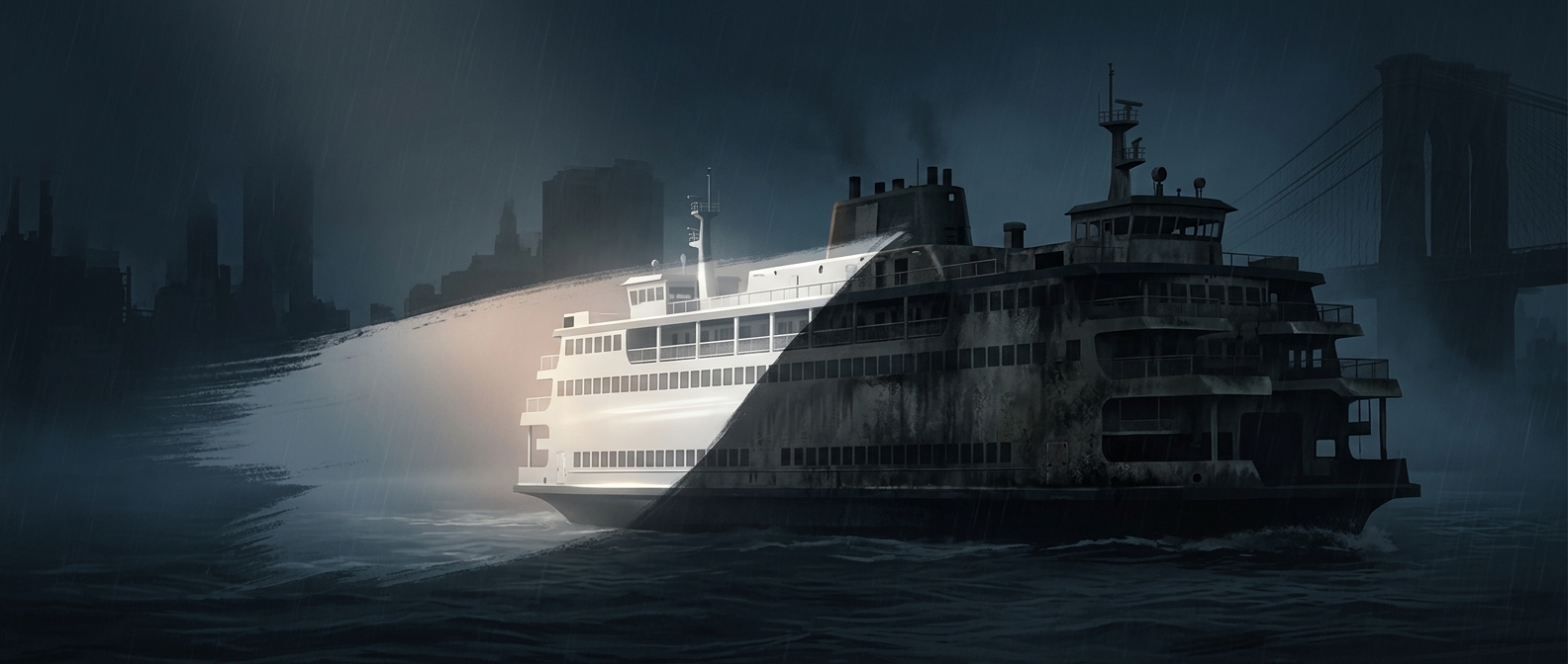
A ferry has to be seen not only by its passengers but by the people navigating around it. On New York Harbor, a vessel can blend into a low-contrast scene of gray water, overcast sky, spray, and fog. A vivid orange hull creates a stronger visual signal, helping other boat crews—and people watching from shore—pick it out sooner.
The advantage comes from contrast. Orange is conspicuous against the harbor’s muted colors, so the ferry’s outline is easier to distinguish from the background. That can help someone judge where the vessel is and notice its movement, especially when visibility is poor. It does not make fog disappear or replace navigation equipment; it gives the eye a useful cue when conditions make visual detection harder.
A practical color with a public identity
The color also makes the Staten Island Ferry recognizable at a glance. Its boats carry large numbers of commuters across the harbor, and their bright hulls are a familiar sight among the water’s traffic. In this case, visibility and identity reinforce each other: the same orange that helps a vessel stand out also makes it unmistakably a Staten Island Ferry.
That is the small but useful logic behind the color. In a harbor crowded with gray backgrounds and moving vessels, being easy to spot is not merely a matter of style—it gives other people a clearer view of what is moving through their path.